Banners Designing~
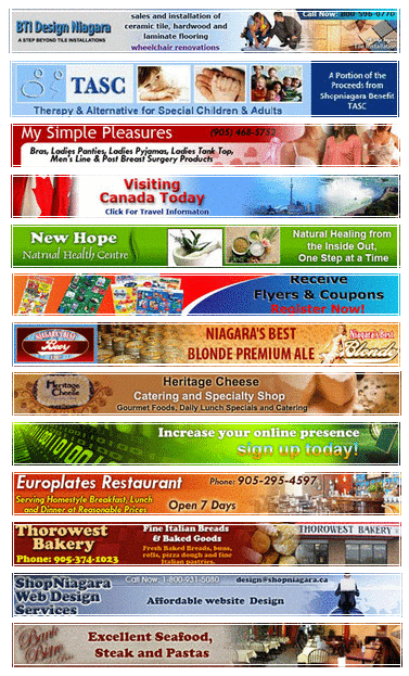
Banners have been a major part of the World Wide Web world since its early days. Copywriters burn the midnight oil looking for new designs that will grab the visitor’s attention and compel him to click on their banner. This article discusses some of the most successful banner designs.
Teasing your curiosity
“Do Not Click Here”. How many of you have seen this slogan in a banner? What did you do when you first saw it? If you are like most people, when you first saw it, you clicked on it. What makes this simple sentence so powerful that it compels the visitor to click on it? The answer is curiosity !!!
Copywriters and web designers are always looking for ways to arouse the website visitor’s curiosity. As banner designers their goal is to attract the visitor to the banner, usually completely ignoring the other elements on the web page that are more important to the website owner. However, because the “Do Not Click Here” slogan tells us nothing about what is on the next page, it arouses the visitor’s curiosity and makes it almost impossible not to click on this banner to see what’s behind it.
Simple integrated design
When Larry Page and Sergey Brin first introduced their product, “Google”, to potential investors, they mentioned Adwords as a backup option in case they didn’t make any money. We all know how lucky they were that they eventually needed to use that backup plan. What made these “boring” ads such a great success?
Unlike other ads, Adwords neither arouse the visitor’s curiosity nor disturb the main flow of the web page. In fact, the opposite is true. Adwords are meant to look like part of the search results giving the user the feeling that those ads are there because he asked for them. No one has any doubt that this simple design helps Google to promote both their search engine and the Ad words advertising program.
Take part in the action
Banner designers wisely used interactive technologies like Flash to develop type of banners that invite the user to take part in the action. Drawing the user into the action can be accomplished in many creative ways. Some web designers use popular old games elements as part of the scene. You all know the famous game pacman. One of the banners that I like the most is the one where the user is allowed to let pacman “eat” few dollar signs. At the successful completion of this mission, a nice slogan is revealed asking him to open a saving account that will earn money with a fixed interest rate. The idea behind those interactive banners is simple: Let the user take part in the action and then at the right moment when his mind is less resistant, show him the sales message. Those interactive banners proved to be very efficient. Their biggest disadvantage is that most webmasters will not allow that kind of banner because it distracts too much from the web page content.
Back to Black and White
Website designers are always seeking to be different with their design ideas. One banner fashion trend that can be found lately is Black and White banners. Although research shows that blue and yellow are the most efficient color to use in a banner, Black and White banners have been seen a lot lately. It’s probably something that will eventually vanish, but the idea behind it is to be different and to make the user wonder what’s up and hopefully click on the banner to find out.
Get Out of the box
Have you heard about the milliondollarhomepage.com? If not, check out this website before continuing to read this article. This website has proven that creative thinking not only can bring you money but also create a whole new trend. Right after the milliondollarhomepage.com got the internet community’s attention, many designers used this idea to deign a banner on which they sell a 10x10 pixel area. Like the original concept, this banner design had its impact. Advertisers are investing money on these ad spaces while at the same time visitors are curious enough time after time looking at those unorganized pixel banners to click on them.
What about the next trends
What the next trends of banner design will be is something that probably no one can accurately predict. It’s up to some web designer to come up with a new concept that proves to be efficient. There is no doubt that in the future we will see new ways of designing banners, especially when more and more advertising budgets are being spent on the internet instead of commercial TV and other types of advertising media.
Cards Decoration~
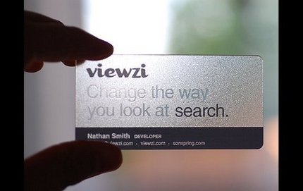
Long gone the days when you simply handed over a white piece of paper with your name and contact info on it to potential clients. Nowadays, who do you think clients will call first, the guy with his name on a sheet of paper or this other one with her name engraved in this colorful plastic wonder?
And what’s that? A little magnifying glass and a free sample of her product? This is too good to be true! She must be really good at her job! I mean, if this is only her business card, just imagine how great the quality of her work must be!
You get the idea, right? Whether you want it or not, image matters. If you want to keep up with the competition, you have to show that you’re a professional in every possible way.
This is good news to designers, since it’s yet another opportunity to come up with new creative ideas to present corporate identities or market themselves, and it’s also good news to everyone else, since having stylish, beautiful business cards is a great way to express your uniqueness and maybe even get an edge over the competition.
Many times people are stuck for card ideas and this is where magazines and online galleries come into their own -Ann View provide you with lots of handmade greeting card examples and design ideas.
- Look at the designs as a whole and then at each individual element, noting the different techniques, unusual combinations of materials or techniques
- Study shop-bought cards you get given, notice the layout, the colours and the composition of the designs (i.e. where design elements are placed on a card)
- Create a notebook with quick sketches - card blueprints - to remind you of basic layout styles and colour combinations
Brochures Designing~
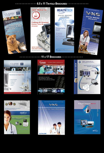
A good brochure must be clear and attractive to the intended audience. Think of the brochures that you or your friend kept from an event you went to, or a place you wanted to go. You may not have identified exactly what design aspect made it unique, but these brochures definitely captured the essence of the event or the company. The ability to embody the spirit of the client and the identity of the company in a mere paper brochure is what makes it memorable, and is proof of a good design.These brochures show exemplary creativity and excellent design...
Are you planning to design leaflets? You can get leaflet design ideas from Ann View. You can also approach our offline designer to provide you with lot of leaflet design ideas. You can design your own leaflet based on the ideas. Download free leaf let templates from the websites and introduce the leaflet design ideas that you learnt from the designer.
When you master our basic designs, you can proceed to advanced designing looks. But unless you have quick grasp of designing and creativity, it is difficult to learn the advanced designing looks on your own. At this juncture, you can seek the assistance of a professional designer to guide you in your making your designs look more fresh, new and attractive.
Strategies to bring out best leaflet designs
First and foremost, come up with different leaflet design ideas. Convert them into a viable theme. Now its time to plan the visual. Dramatize the theme or the situation that you thought of using pictures, images, sketches, drawings in the leaflet. Later, plan the text. Make sure your leaflet does not have rambling content. Come up with a relevant headline. Make the headline to four or five words. There are various kinds of headlines. Teaser headline, banner headline, kicker headline etc Use a headline that will fit in your leaflet well. Usually teaser headlines are the most sought after ones in leaflets. Following the headline, come up with the message that you want to convey in few sentences. We make sure the content reflects the idea and do not sounds like a mere ‘gimmick’. A brilliant businessman will include a ‘call to action’ in his leaflets. This will ensure him that the readers not only simply read through his leaflets but also act on his message. Plan each element well. We also decide the placement of text, headline and the image. Place various elements in such a fashion that the eye movement of the readers proceeds from the image (to which the eyes are attracted first) to the headline and further to the message. The leaflet should hold the attention of the readers at least for four to five seconds. If the designer employs highly brilliant artworks in his leaflet design, the viewer will need more than five seconds to comprehend the message. But readers would hardly take their time out to comprehend an advertising copy. So the message should get across their minds simply at a glance.
